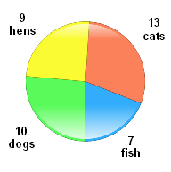
A pie chart is a circular chart which is divided
into sectors, illustrating relative magnitudes or frequencies
or percents. In a pie chart, the arc length of each sector
is proportional to the quantity it represents. Together,
the sectors create a full disk.
A pie chart,
like a pictogram, is a way of presenting statistical data in a visual
form which can be easily understood. A circle is divided up, like
a pie, into sectors in proportion to the frequencies of the data.